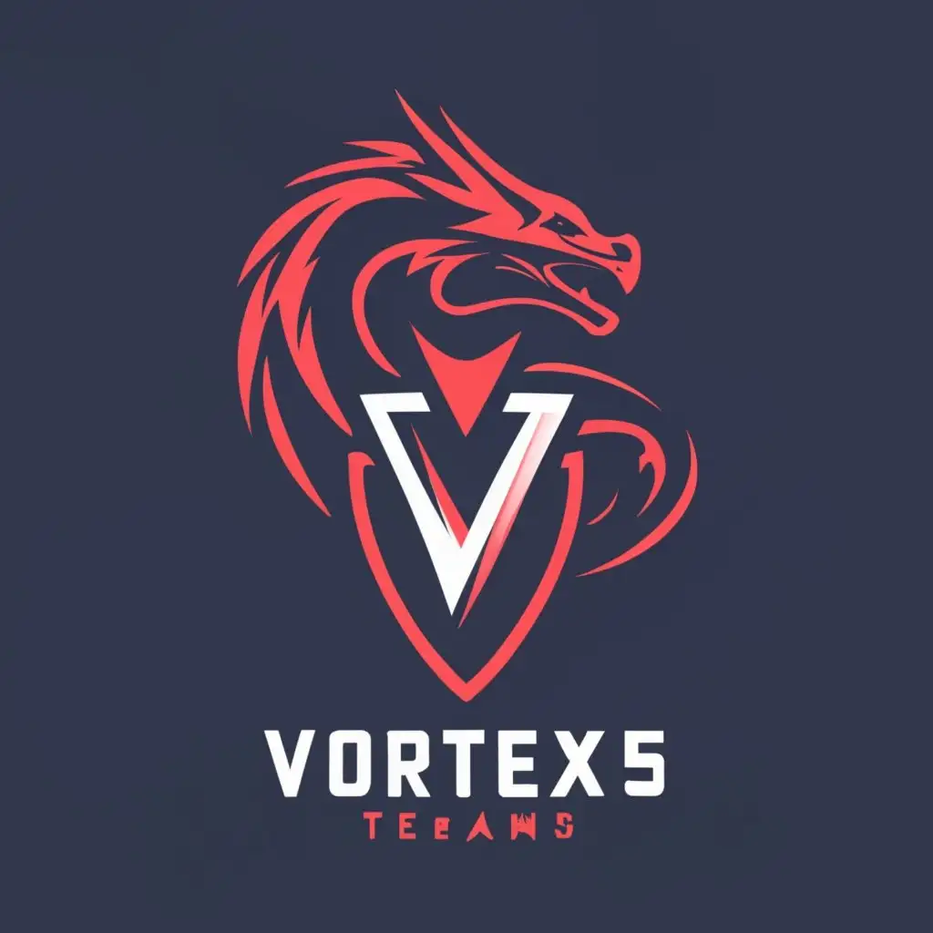
LOGO Design For Vortex5 Bold V5 Emblem in Blood Red Obsidian Black
Logo Prompt
Prompt
VORTEX5
LOGO SYMBOL: Create an esport logo for a team named Vortex5. Design the logo as a V5 and place the full team name below it. Use blood red and obsidian black color scheme. Write "VORTEX5" beneath the actual logo in a clear, minimalistic font. Add the spelled-out version of "VORTEX5" above the logo's icon.
INDUSTRY: Internet
Related Logos
AI Generated Logo Prompt Analysis
- Subject: Inspiration Behind the Logo Design The logo for Vortex5 draws inspiration from the essence of power and dominance, reflecting the competitive spirit of esports. The 'V5' emblem signifies strength and unity within the team, depicted in a bold and modern style. The choice of blood red and obsidian black colors signifies intensity, fierceness, and a sense of mystery, creating an impactful visual. Subject: Symbolism of Colors and Graphics Blood red symbolizes energy, passion, and determination, reflecting the team's vigor in the competitive gaming arena. Obsidian black embodies sophistication, resilience, and a formidable presence, highlighting the team's unwavering resolve. The addition of a dragon, a symbol of strength and prowess, elevates the logo's visual impact, resonating with the gaming industry's dynamic nature. Subject: Detailed Explanation of Design Elements The 'V5' emblem takes center stage, exuding simplicity yet dominance. The clear, minimalistic font used for 'VORTEX5' below the emblem enhances legibility without compromising on the logo's commanding presence. Placing the spelled-out version of 'VORTEX5' above the icon reinforces brand recognition and solidifies the team's identity. Subject: Design Style and Trends The design aligns with modern aesthetics, incorporating elements that resonate with the esports domain. Its minimalistic yet potent appearance reflects current trends in logo design, ensuring it stands out within the competitive landscape of esports. The emphasis on making 'VORTEX5' pop out more emphasizes the brand's omnipotence and ferocity, aligning with the competitive standards akin to leagues like LCK in the esports realm.