LOGO Design For Rubiks Cube Geometric Typography for Tech Industry
Related Logos
Related Tags
AI Generated Logo Prompt Analysis
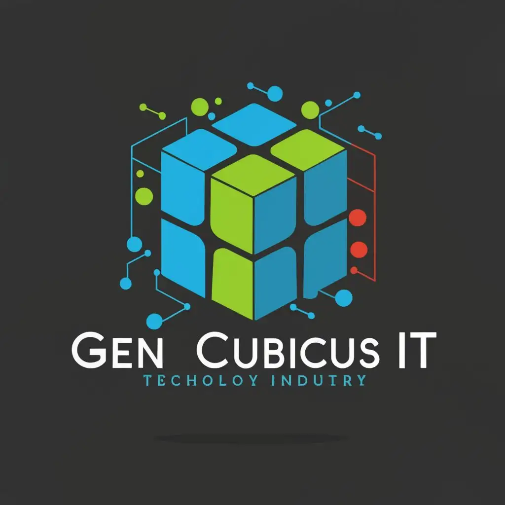
- Subject: Inspiration Behind the Logo Design Rubik's Cube, a timeless symbol of problem-solving and intelligence, serves as the primary inspiration. The intricate patterns and colors of the Rubik's Cube reflect the complexity and innovation synonymous with the technology industry. Subject: Symbolism of Colors and Graphics The vibrant colors of the Rubik's Cube symbolize diversity, creativity, and dynamism within the tech sector. Each color represents a different facet of technology, from creativity (orange) to stability (blue), portraying the versatility of the industry. The geometric shapes highlight precision, logic, and futuristic outlook. Subject: Detailed Explanation of Design Elements The logo features a stylized Rubik's Cube with sleek, modern typography reading 'GEN CUBICUS IT.' The cube's rotating layers symbolize adaptability and problem-solving skills, essential traits in the tech field. The typography's clean lines and geometric shapes echo the cube's design, reinforcing the brand's identity. Subject: Design Style and Trends The design adopts a minimalist approach with bold geometric elements, aligning with contemporary design trends. It prioritizes simplicity and clarity, ensuring scalability across various digital and print mediums. This timeless design ensures longevity and relevance in the ever-evolving tech industry landscape.