LOGO Design For BeachFit Energetic Typography with a Carefree Vibe
Related Logos
Related Tags
AI Generated Logo Prompt Analysis
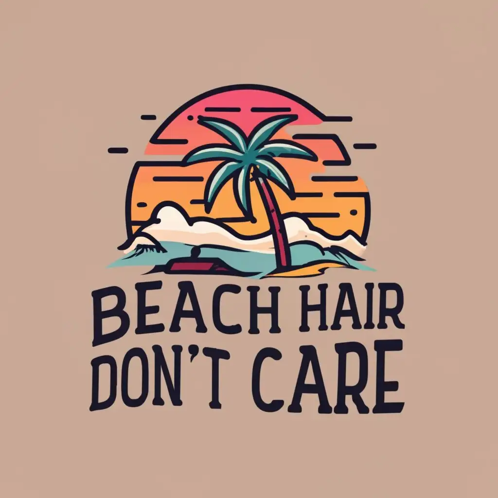
- Subject: Inspiration Behind the Logo Design The logo for BeachFit draws inspiration from the lively and carefree atmosphere of beach life, reflecting the spirit of the Sports Fitness industry. The incorporation of the text 'Beach hair, don't care' emphasizes the relaxed and energetic vibe associated with outdoor activities and fitness. Subject: Symbolism of Colors and Graphics The color scheme is vibrant and reminiscent of the beach, with shades of blue and hints of yellow, creating a visually appealing and energetic impact. Graphics may include dynamic waves or abstract representations of beach elements, reinforcing the connection to the Sports Fitness theme. Subject: Detailed Explanation of Design Elements The typography used in the logo is bold and dynamic, conveying strength and movement. The chosen font style reflects the modern and energetic nature of the Sports Fitness industry, while the incorporation of beach-related graphics adds a touch of playfulness. Subject: Design Style and Trends The logo embraces a contemporary design style, combining bold typography with minimalist graphics. This approach aligns with current design trends, ensuring a timeless and versatile logo for BeachFit that resonates well with the target audience in the Sports Fitness sector.