LOGO Design for Cleanup Company Bright TealTurquoise Letter B with Clear Background
Logo Prompt
Prompt
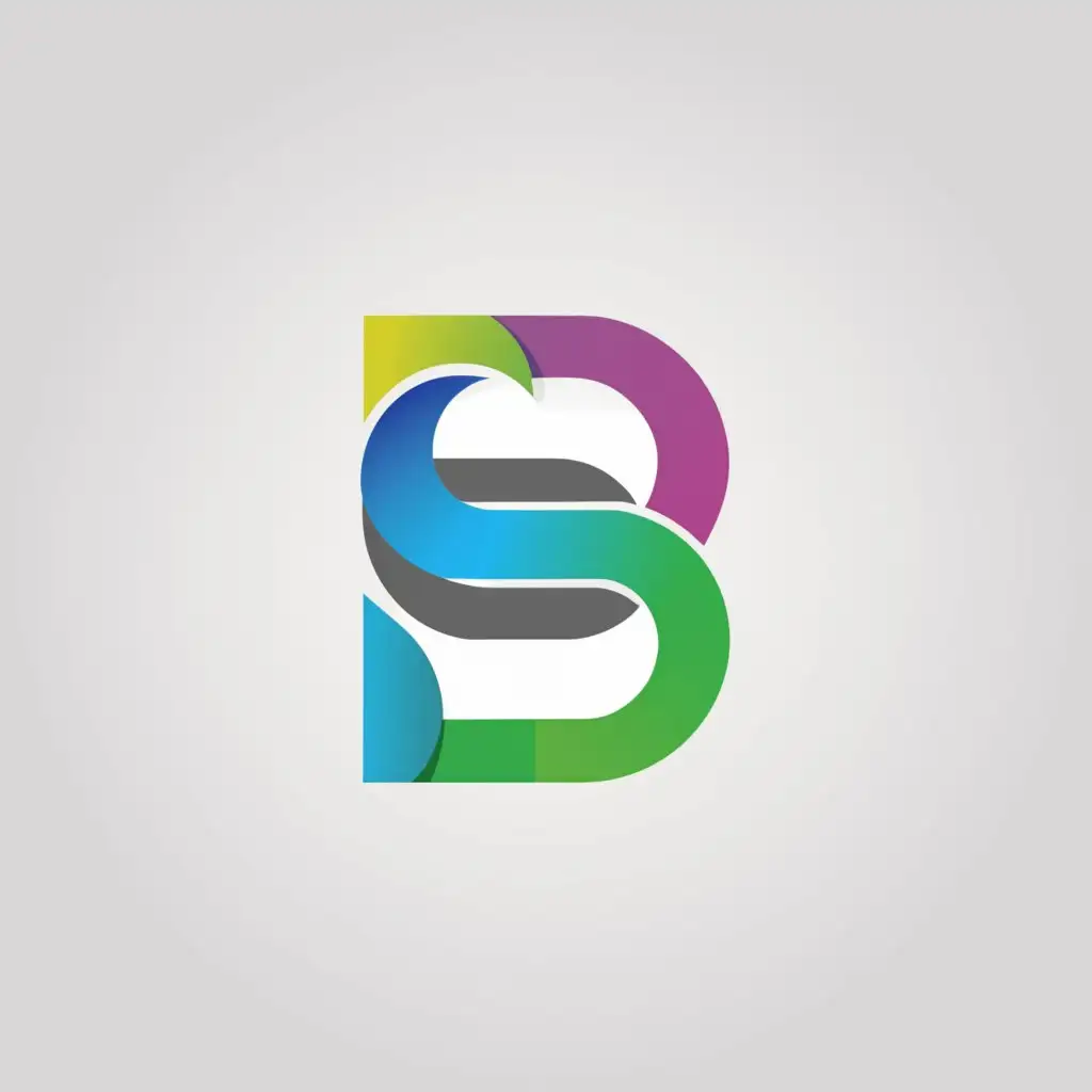
Logo Redesign and Clean-up Company
LOGO SYMBOL: I would like to make a logo SIMILAR to the attached photo.
Can we update it by making it more clear and brighter.
The original logo is the letter "B" with the letter "C" in the middle of it.
The COLOR should be Similar to the picture, **Teal/Turquoise**
INDUSTRY: Others
Related Logos
Related Tags
AI Generated Logo Prompt Analysis
- Subject: Inspiration Behind the Logo Design The client seeks a logo redesign for a clean-up company, aiming for a more polished and clear representation. The attached photo serves as the basis for the redesign, indicating a preference for a similar style. The main symbol is a letter 'B' with the letter 'C' embedded within it, symbolizing the initials of the company's name. This choice reflects simplicity and professionalism, aligning with the company's focus on clean-up services. Subject: Symbolism of Colors and Graphics Teal/Turquoise is chosen as the primary color, conveying qualities of cleanliness, freshness, and clarity. These characteristics resonate well with the company's mission of providing clean-up solutions. The brightness of the color adds vibrancy and modernity to the logo, enhancing its visibility and appeal. The clear background reinforces a sense of transparency and openness, reflecting the company's commitment to clarity and efficiency. Subject: Detailed Explanation of Design Elements The letter 'B' serves as the central element of the logo, representing the initial of the company's name. The incorporation of the letter 'C' within the 'B' symbolizes the complete name of the company, creating a cohesive and visually appealing design. The choice of a clean, sans-serif font enhances readability and modernity, complementing the overall aesthetic of the logo. Subject: Design Style and Trends The logo adopts a minimalist approach, focusing on essential elements to convey the company's identity and message effectively. This aligns with current design trends favoring simplicity and clarity. The use of bright teal/turquoise color adds a contemporary touch, keeping the logo visually engaging and memorable. Overall, the design reflects a balance between professionalism, modernity, and clarity, positioning the company effectively in its industry.