LOGO Design for SkullCrush Fitness Powerful Fist Symbolism in Sports Typography
Related Logos
AI Generated Logo Prompt Analysis
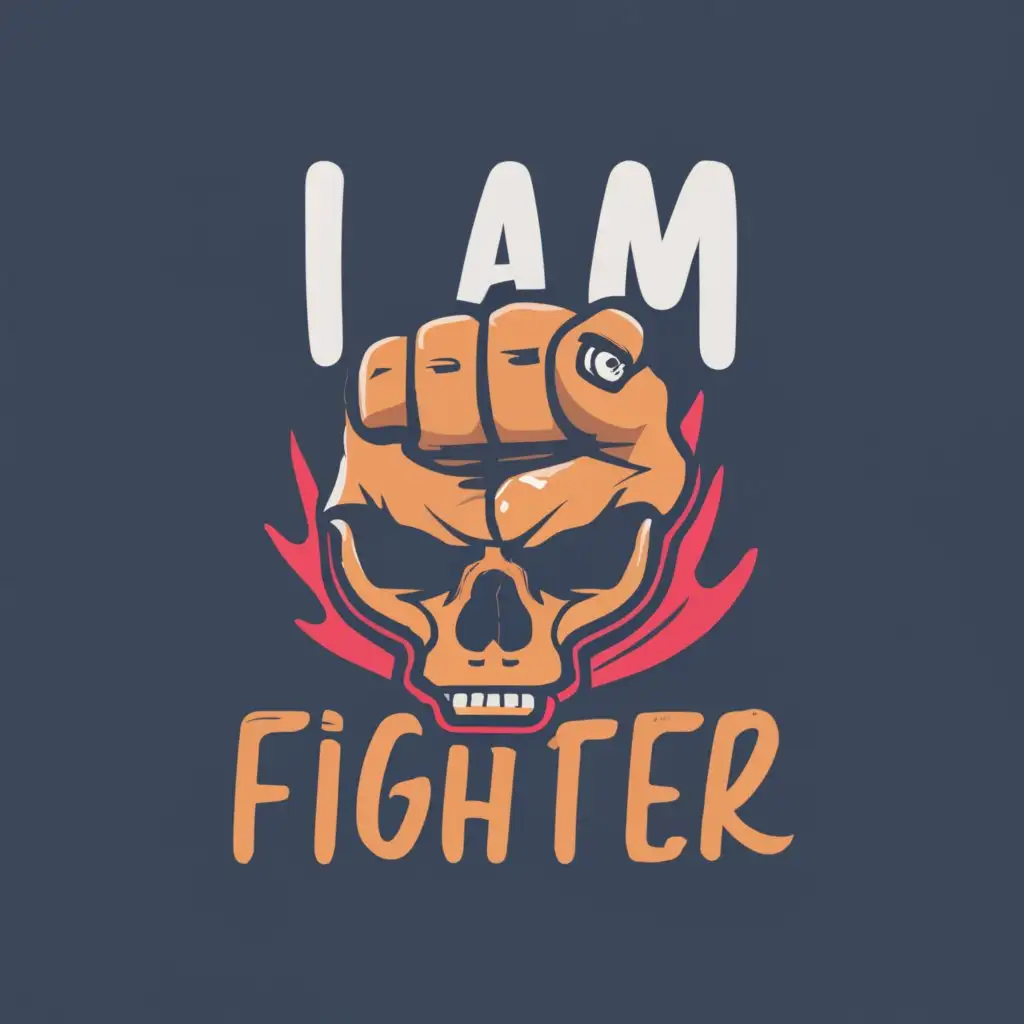
- Subject: Inspiration Behind the Logo Design The logo for SkullCrush Fitness draws inspiration from strength, power, and determination in the Sports Fitness industry. The central element, a fist destroying a skull, symbolizes the relentless pursuit of excellence and the conquering spirit inherent in fitness enthusiasts. Subject: Symbolism of Colors and Graphics The choice of colors plays a crucial role in conveying the brand's identity. Dark, intense shades like black and red evoke energy, intensity, and passion. These colors complement the powerful fist graphic, creating a visual representation of strength and vigor. The typography, with bold and dynamic lettering, reinforces the message of being a fighter in the fitness journey. Subject: Detailed Explanation of Design Elements The focal point of the logo, the fist, is intricately designed to showcase muscular details and dynamic movement. The shattered skull beneath symbolizes breaking through limitations and pushing boundaries. The text 'I am fighter' adds a personal touch, encouraging a sense of empowerment and individual strength. Subject: Design Style and Trends The logo embraces a contemporary and edgy design style, aligning with current trends in the Sports Fitness industry. The combination of powerful symbolism, bold typography, and a minimalistic approach ensures versatility across various marketing channels and merchandise.