LOGO Design for Balus Tea Empire Captivating Typography for Coffee Shop in the Restaurant Industry
Related Logos
AI Generated Logo Prompt Analysis
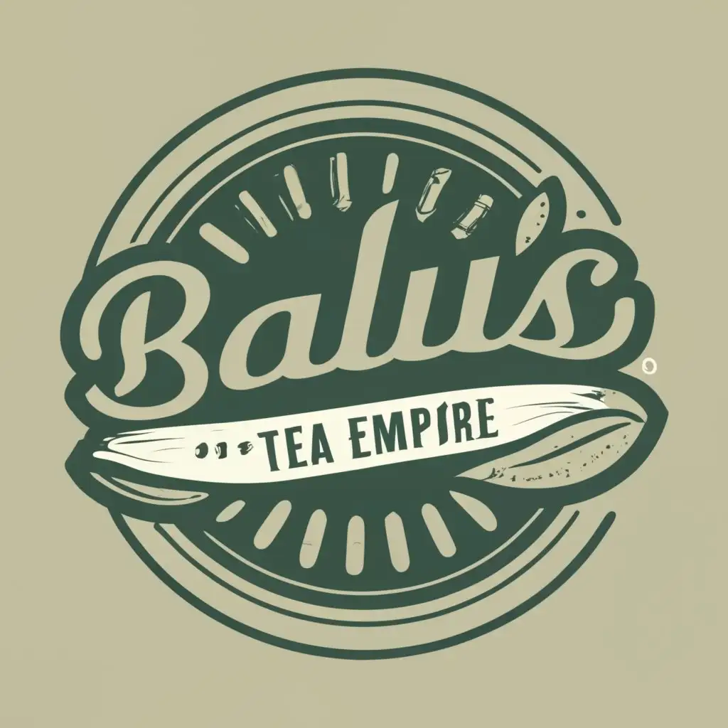
- Subject: Inspiration Behind the Logo Design Balu's Tea Empire logo draws inspiration from the rich tradition of tea culture, symbolizing a fusion of elegance and warmth. The choice of a coffee cup in the design reflects the diverse offerings, catering not only to tea enthusiasts but also to coffee lovers, creating a welcoming ambiance for patrons. Subject: Symbolism of Colors and Graphics The color palette incorporates earthy tones to evoke a cozy and inviting atmosphere. Shades of warm browns and soothing greens signify the natural origins of tea and coffee, while a touch of gold adds a hint of sophistication. The coffee cup graphic reinforces the brand's focus on quality beverages, making it visually appealing and easily recognizable. Subject: Detailed Explanation of Design Elements Typography plays a crucial role with 'Coffee Shop' elegantly integrated, utilizing a stylish and legible font. The coffee cup icon complements the text, forming a cohesive design that communicates the essence of Balu's Tea Empire. The overall layout ensures scalability and versatility for various applications, from signage to digital platforms. Subject: Design Style and Trends The design embraces a modern yet timeless style, aligning with current design trends while maintaining a classic appeal. Clean lines, balanced proportions, and a harmonious color scheme contribute to a logo that stands out in the competitive restaurant industry, ensuring lasting visual impact.