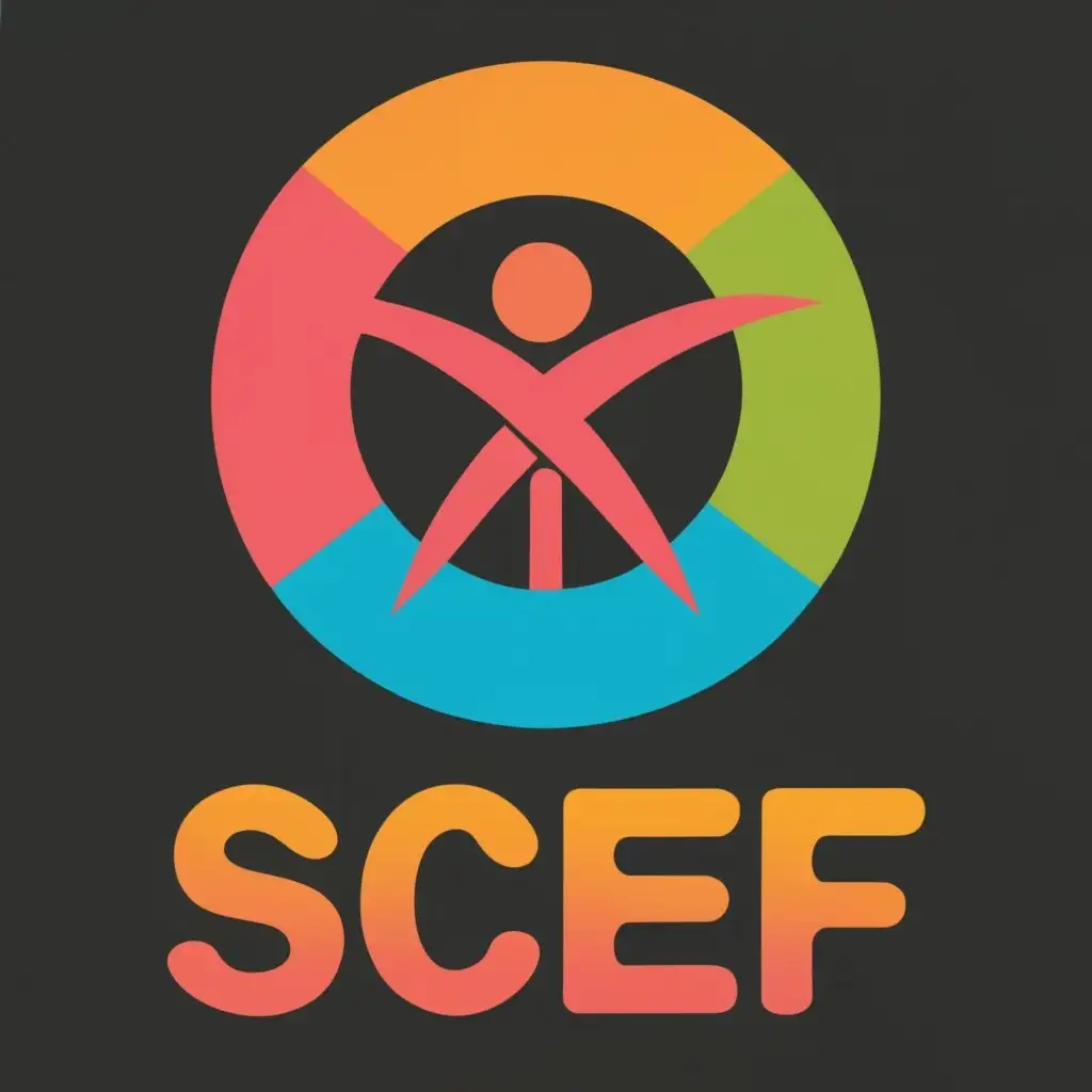
LOGO Design for Safety for Child Empowerment Foundation SCEF Symbolizing Hope and Protection for Children
Related Logos
AI Generated Logo Prompt Analysis
- Subject: Inspiration Behind the Logo Design Safety for Child Empowerment Foundation (SCEF) is dedicated to empowering children and providing them with a safe environment. The inspiration behind the logo design should reflect the foundation's mission. Consider incorporating elements that symbolize hope, protection, and empowerment. A combination of imagery related to children, safety symbols, and a touch of optimism could form a compelling and meaningful design. Subject: Symbolism of Colors and Graphics The color scheme plays a crucial role in conveying the message. Opt for colors that evoke a sense of safety and warmth. Blues and greens can represent trust and growth, while incorporating child-friendly graphics like playful silhouettes or simple illustrations can add a touch of innocence and joy to the logo. Subject: Detailed Explanation of Design Elements Include elements that directly relate to the foundation's cause. Consider integrating symbols of protection such as a shield or guardian figure. Typography should be clear and friendly, ensuring easy readability. The incorporation of the foundation's acronym, SCEF, within the design can enhance brand recognition. Subject: Design Style and Trends A timeless design is crucial for a nonprofit logo. Avoid overly complex elements and trendy graphics that may quickly become outdated. Opt for a clean and versatile design that can adapt to various platforms and mediums, ensuring the logo remains relevant for years to come.