LOGO Design For Nonprofit Crown Symbol with Inspirational Slogan
Related Logos
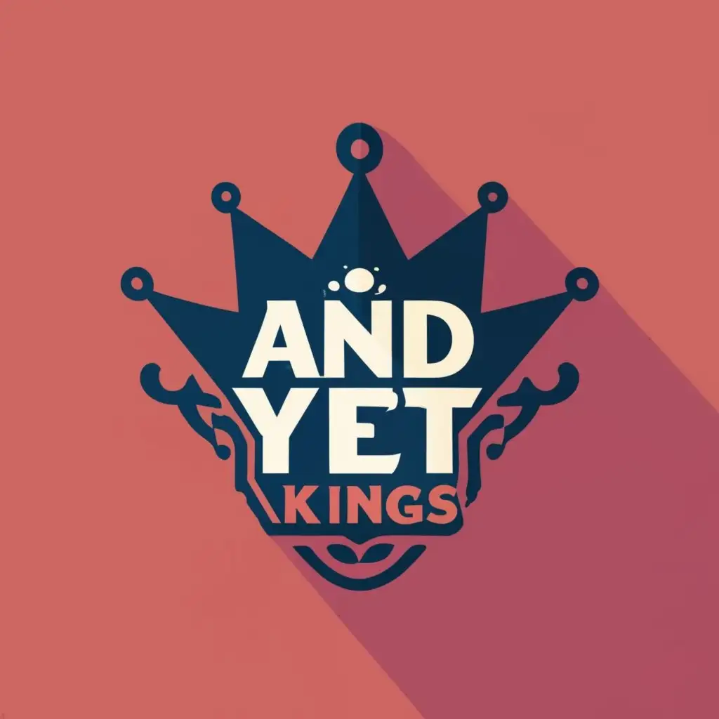
AI Generated Logo Prompt Analysis
- Subject: Inspiration Behind the Logo Design The inspiration behind this logo design for a Nonprofit organization is rooted in the symbol of a crown. The crown represents a sense of royalty and nobility, suggesting that every individual, despite challenges, has the potential to be a 'king' in their own right. This aligns perfectly with the nonprofit sector's mission to uplift and empower individuals. The typography, featuring the text '... AND YET KINGS,' adds a layer of inspiration, implying resilience and triumph over adversities. Subject: Symbolism of Colors and Graphics The color scheme chosen for this logo revolves around regal tones, reflecting the dignity associated with a crown. Deep blues and rich golds can convey a sense of prestige and trustworthiness, important qualities for a nonprofit brand. The crown symbolizes leadership and the idea of making a positive impact on the community. Subject: Detailed Explanation of Design Elements The logo incorporates a stylized crown as the central graphic element, emphasizing the organization's commitment to uplifting individuals. The choice of typography adds a modern touch, balancing tradition with contemporary design trends. The ellipsis before 'AND YET KINGS' creates a sense of anticipation and curiosity. Subject: Design Style and Trends The design follows a clean and modern style, aligning with current logo design trends. The use of a symbol alongside well-crafted typography ensures versatility, making the logo suitable for various applications, from digital platforms to print materials.