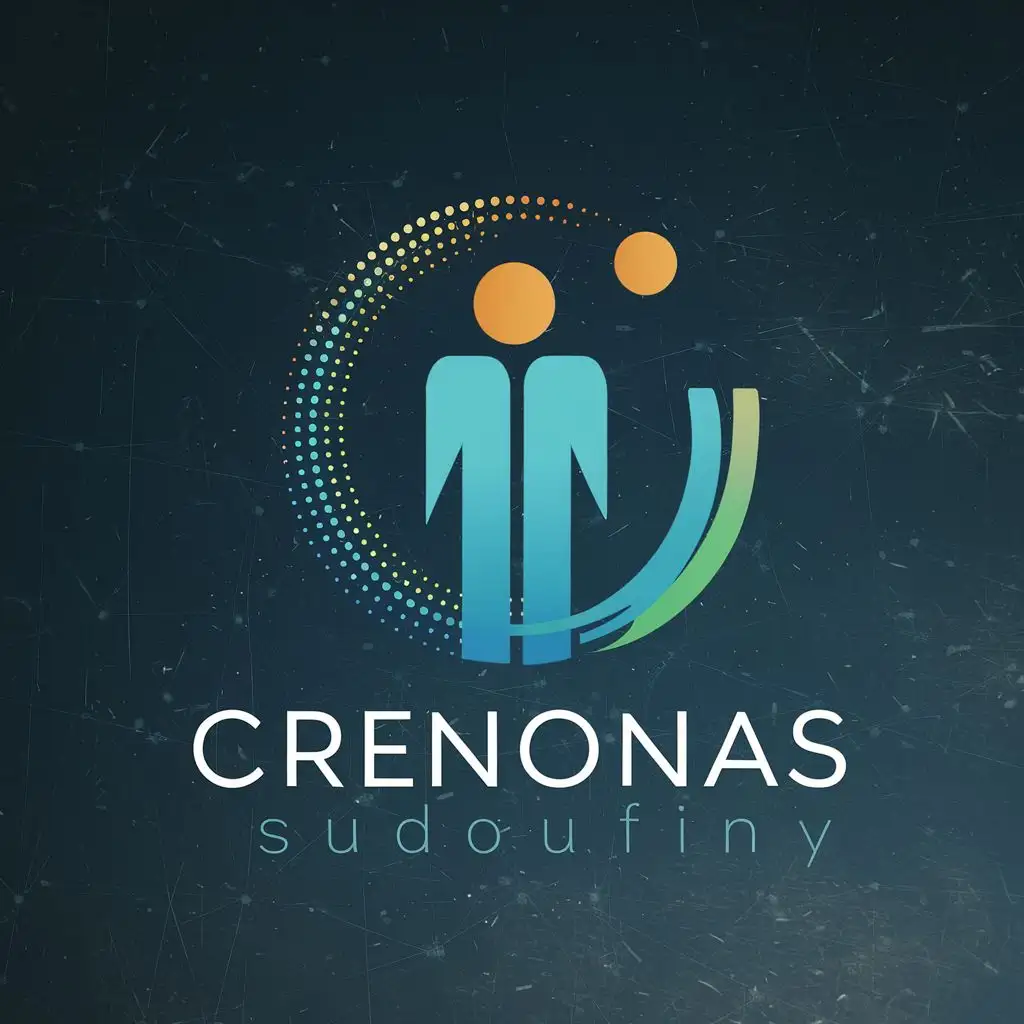
LOGO Design for Human Solutions Abstract Growth Figure in Blue and Gray with Dynamic Orange Accent

Logo Prompt
Prompt
human solutions
LOGO SYMBOL: the logo should consist of an abstract figure - representing both corporate and individual customer bases of the company. The figure is at the center, standing taller, singifying grownth and the evolution journey clients undergo when they engage with the company. Wrapping around this center figure is a circular shape that starts as a solid line then evolves into dots, creating a representation of progress, innovation, and adaptability. This signifies the forward-thinking approach and flexibility of the company while subtly indicating the cyclical nature of HR tasks including recruitment, training, assessment, development and retention.
In terms of colour scheme, a combination of cool blues and sleek grays are used to show pofessionalism, loyalty and trust. The usage of a bright focal point in the color spectrum, such as enpowering yellow or dynamic orange shows positivity, energy and innovation.
INDUSTRY: Others
Related Logos
AI Generated Logo Prompt Analysis
- Subject: Inspiration Behind the Logo Design The logo design for Human Solutions draws inspiration from the company's focus on growth and evolution in the field of human resources. The abstract figure at the center symbolizes the journey of clients as they progress and develop with the company's assistance. Subject: Symbolism of Colors and Graphics The color scheme of cool blues and sleek grays reflects professionalism, loyalty, and trust, aligning with the corporate nature of HR tasks. The addition of a dynamic orange accent adds vibrancy, energy, and innovation, signaling the company's forward-thinking approach. Subject: Detailed Explanation of Design Elements The central abstract figure represents growth and evolution, while the circular shape wrapping around it symbolizes progress, innovation, and adaptability. The transition from a solid line to dots within the circle illustrates the cyclical nature of HR tasks, including recruitment, training, assessment, development, and retention. Subject: Design Style and Trends The design style embraces abstraction to convey complex ideas simply and elegantly. It aligns with contemporary trends in logo design, where minimalism and symbolism are key elements to convey a brand's identity effectively.