LOGO Design For SouthFlavour Cannabis Elegant Typography with a Botanical Twist
Related Logos
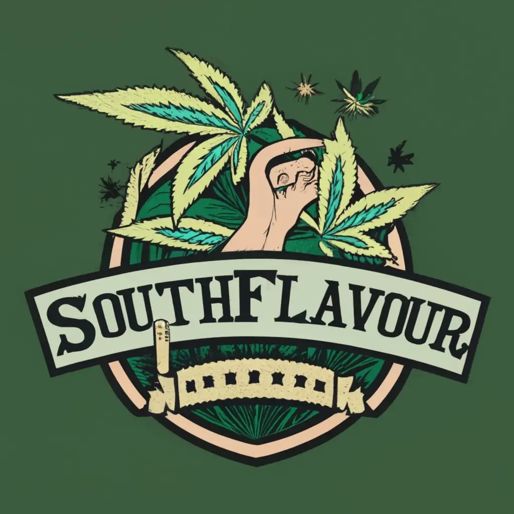
AI Generated Logo Prompt Analysis
- Subject: Inspiration Behind the Logo Design Drawing inspiration from the lush landscapes of South Florida, this logo encapsulates the essence of Cannabis with a botanical twist. The typography is chosen to convey sophistication and elegance, reflecting the premium quality of the product. Subject: Symbolism of Colors and Graphics The color palette incorporates earthy greens and subtle browns to symbolize the natural origins of Cannabis. Intricate graphics of cannabis leaves and subtle plant elements complement the overall design, emphasizing the organic and authentic nature of SouthFlavour's products. Subject: Detailed Explanation of Design Elements The logo features a harmonious blend of typography and botanical graphics. The Cannabis leaves are delicately intertwined with the text 'SouthFlavour,' creating a seamless connection between the brand name and the product it represents. The choice of a clean and modern font enhances readability while maintaining a sense of refinement. Subject: Design Style and Trends In line with contemporary design trends, the logo adopts a minimalist approach with a focus on essential elements. The use of botanical elements aligns with the growing trend of embracing nature-inspired designs in the cannabis industry, creating a visually appealing and timeless logo for SouthFlavour.