LOGO Design For The Common Man Empowering Simplicity with Striking Typography
Related Logos
AI Generated Logo Prompt Analysis
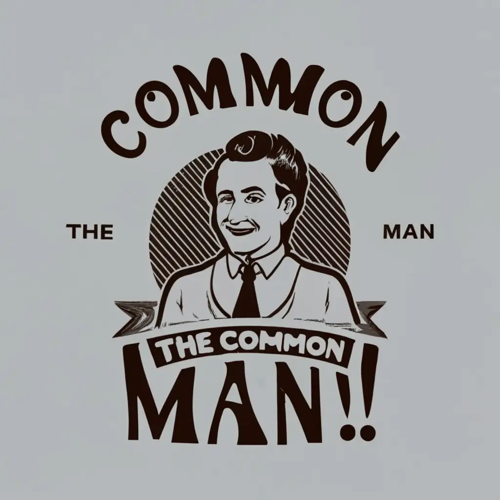
- Subject: Inspiration Behind the Logo Design The logo design for 'The Common Man' draws inspiration from the essence of simplicity and relatability. The choice of featuring a common man in the logo symbolizes inclusivity, connecting with a wide audience on a personal level. This design aims to communicate approachability and universality, making it relatable to people from all walks of life. Subject: Symbolism of Colors and Graphics The color scheme is deliberately kept neutral, reflecting the idea of commonality. The use of earthy tones conveys a sense of groundedness and authenticity. The typography plays a crucial role, with bold and striking lettering emphasizing strength and resilience. The combination of graphics and text serves to create a balanced and memorable visual identity. Subject: Detailed Explanation of Design Elements The central figure of a common man represents the core values of the brand, emphasizing the importance of every individual. The typography is carefully chosen to enhance readability and leave a lasting impression. Subtle details in the graphics, such as facial expressions and body language, contribute to the overall narrative of approachable empowerment. Subject: Design Style and Trends This logo aligns with the current trend of minimalist design, focusing on essential elements that convey a powerful message. The bold typography reflects a modern and confident style. By embracing simplicity and clarity, the design remains timeless while staying relevant in the ever-evolving visual landscape.