LOGO Design For Vortex5 Bold V5 Symbol in Blood Red Obsidian Black
Logo Prompt
Prompt
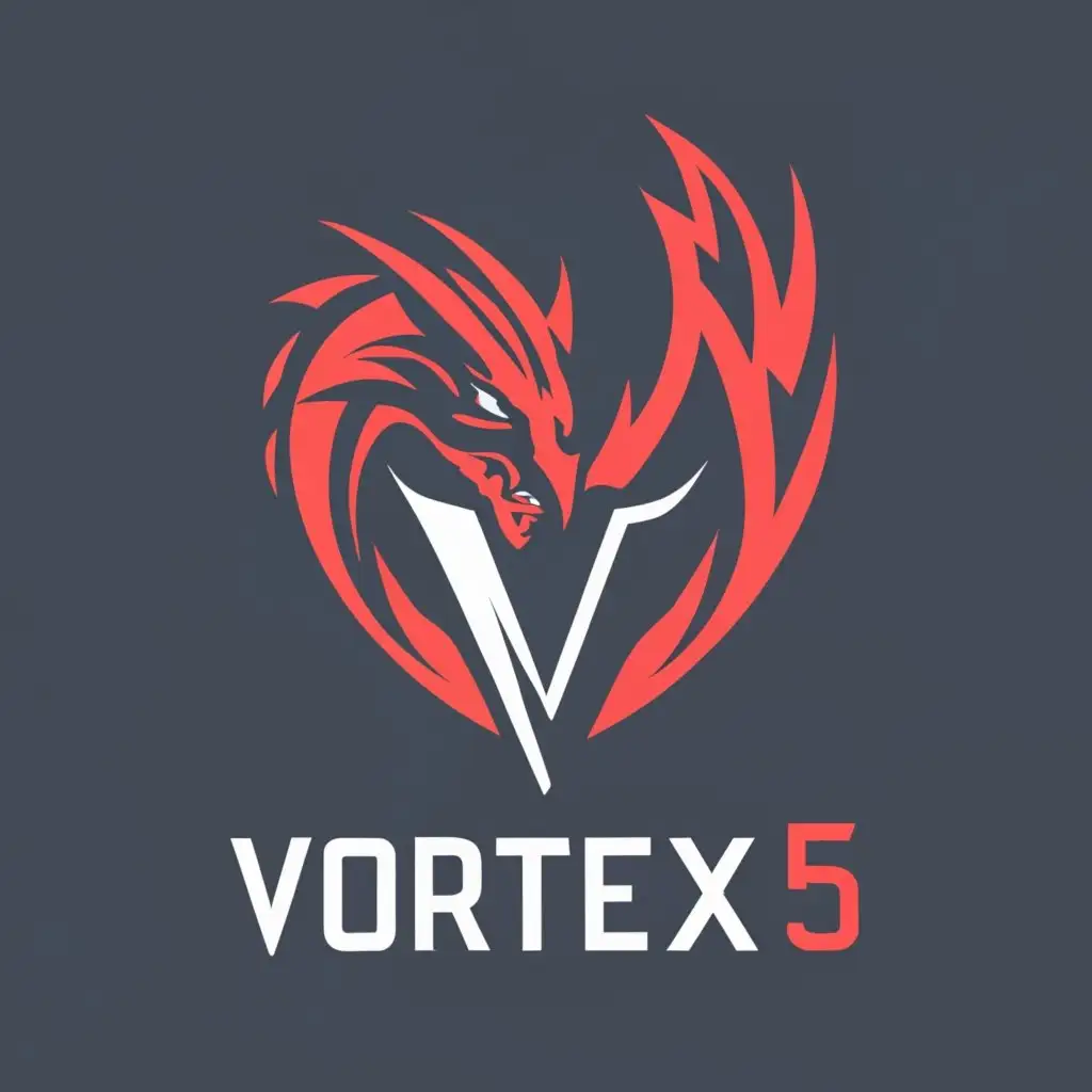
VORTEX5
LOGO SYMBOL: Create an esport logo for a team named Vortex5. Design the logo as a V5 and place the full team name below it. Use blood red and obsidian black color scheme. Write "VORTEX5" beneath the actual logo in a clear, minimalistic font. Add the spelled-out version of "VORTEX5" above the logo's icon.
INDUSTRY: Internet
Related Logos
AI Generated Logo Prompt Analysis
- Subject: Inspiration Behind the Logo Design The inspiration behind the Vortex5 logo design draws from the team's name and competitive gaming roots. The use of 'V5' as the central icon symbolizes the team's identity and unity, resonating with the 'Vortex5' name. The incorporation of a dragon signifies power, fierceness, and a connection to mythical elements, aligning with the competitive nature of esports like League of Legends and the influence of renowned players like FAKER in the LCK. Subject: Symbolism of Colors and Graphics The blood red and obsidian black color scheme creates a striking contrast, representing intensity, strength, and dominance. Red evokes passion, energy, and determination, while black conveys sophistication, mystery, and authority. These colors complement each other to convey a sense of ferocity and power, further emphasized by the addition of the dragon graphic. Subject: Detailed Explanation of Design Elements The minimalist font used for 'VORTEX5' beneath the logo ensures clarity and modernity. Placing the spelled-out version of 'VORTEX5' above the icon adds emphasis and reinforces brand recognition. The incorporation of the dragon, while subtle, adds depth and character to the logo, reinforcing the team's ferocious and omnipotent presence in the esports arena. Subject: Design Style and Trends The logo's minimalistic approach aligns with contemporary design trends, ensuring scalability and adaptability across various digital platforms, a crucial aspect in the Internet industry. The emphasis on making 'VORTEX5' pop out more aligns with the trend of creating bold, memorable branding elements to stand out in competitive gaming, resembling the iconic and dominant presence akin to champions in League of Legends.